Thursday, March 24, 2022

March 2022

 How to safely store your artwork

You have put hours and hours into creating your work, be it paintings or drawings. Not everything can be hung on your walls. You could give away everything you make or even sell the lot as well. But barring that, you must find a place to put all your artwork.

Over 20 years ago when I went back to fine art, I simply stuffed everything in filing cabinets. Not a good idea. First of all, some of my paper yellowed, rendering it impossible to save. I also didn’t have papers or canvases that were the right size for the drawers. So, I often just jammed them into the cabinets. Yup, rather stupid.  I was sloppy and not thinking properly. 

I do things very differently now. For instance, I store all my paintings, especially those that are framed, in a dry, cool place—usually in an extra closet. Because I have created a lot of paintings over the years and have literally run out wall space, I use my “art” closet to do a ‘round robin' of works to put up occasionally. I don’t necessarily wrap each painting in paper, but I do stack them upright since that’s the primary position for a painting.

I don’t recommend attics or basements unless they’re finished and don’t go over the temperature of 75° and with a humidity of no higher than 50°. Sunlight is a killer for artwork, so always keep it away from windows, even if the art product says its colorfast. Of course, you want to keep your paintings clean, dusting occasionally. 

If you can’t store anything in your house and the only space you have is in the garage, try to keep it cool in the summer and dry in the winter. Use risers or some sort of shelving to keep the artwork off the ground and try avoid making a pile without some sort of archival paper in between. 

As for oil pastel paintings never, ever store them in a hot spot (even your car on a hot day). The pastel paint will melt, believe me. It’s happened! One more thing, refrain from using bubble wrap or just plain plastic wrap to cover your paintings. It’s easy to trap moisture or even mold spore inside, causing a bloody mess.

My recommendation

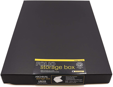
When I’m not storing my work in my closet, I use two storage items: Archival storage portfolios and/or Archival storage boxes. Both products are easy to store by placing them in a bookcase. They come in a variety of sizes.
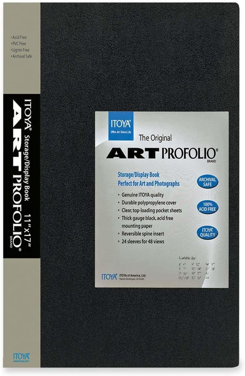


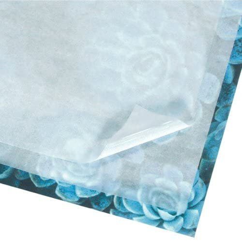
Also I would suggest purchasing some Acid-Free Interleaving Tissue Paper to place between each piece to keep things as pristine as possible.


Lastly, I would also suggest you create a list of what's inside. I can't tell you how many times I have had to go through my storage containers to find what I want.
-------------------------------------------------------------------------------------------------

What's coming up in April?

Drawing Flowers in Colored Pencil


Hope you have a wonderful Spring!

Thursday, February 10, 2022

February 2022 Newsletter: Composition/Classes: Root Vegetables

Principles of Design
Unknowingly, you already have a good sense of design. Through our constant bombardment from magazines, television and Internet, you have been exposed to thousands of visual messages. You know what looks good and what doesn’t. Sometimes the unusual will be used to grab attention (a negative is as good in some cases). But in general, you intuitively know if a design is off. So relax. It’s not as hard to create a good design as you think. Here are the eight principles we will cover:

  • Balance
  • Contrast
  • Scale 
  • Proportion
  • Pattern
  • Rhythm
  • Emphasis
  • Variety
  • Unity

Why is learning the principals of design so important? Just like when composing a letter or a blog, you want to make sense, offering some continuity from one paragraph to the next. The same goes for a piece of artwork. I like to think of my work, especially landscapes, as stories, inviting someone in to enjoy the sight. What’s more, I want my viewer to stay a while and see the beauty I have seen.

Balance


Balance can be symmetrical (formal balance) or asymmetrical (informal balance)


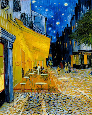
Contrast

Contrast can be accomplished with white, black and gray, monotones or colors. 

Vincent van Gogh, Café Terrace at Night, 1888
Rules of thumb:
  • A dark color put next to a light one makes them both look brighter.  
  • Dark next to bright makes the bright one look brighter.  
  • Dark next to light makes the light seem lighter and the dark darker.  
  • Warmer colors look warmer when placed next to cool ones. 
  • Cool colors look cooler when placed next to warm ones.  
  • A bright color next to a muted color makes the muted one look more dull.  
  • If two colors are of a similar brightness, the less bright they'll both look when placed next to each other. Source

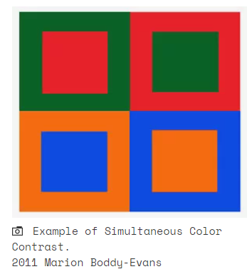
“Simultaneous contrast refers to the way in which two different colors affect each other. The theory is that one color can change how we perceive the tone and hue of another when the two are placed side by side. The actual colors themselves don't change, but we see them as altered. “ Marion Boddy-Evans

Proportion & Scale
Proportion does not deal with how big or small something is but rather the relationship between two or more objects. Scale refers to size. Thus, the earth and moon are different in scale but share the same proportion.

Patterns
Of course, patterns are fairly simple to grasp. Simply defined, a pattern is the repetition on the same thing over and over again. They can be geometric or organic. You will find patterns to be most prominent in nature.


Rhythm
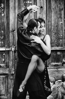
Rhythm is just what it says, movement. The photo below offers a wonderful example of rhythm just in the models pose. I can even hear the music.


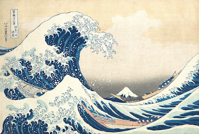
Here's another example:

Katsushika Hokusai, Under the Wave off Kanagawa or The Great Wave
1830-1832, woodblock print, ink on paper.

Emphasis
Generally, you may want to pick a spot (some call a hot spot or sweet spot) that you want to emphasize. I've had teaches who would demand I find that spot and center my entire painting around it. Not sure if that's necessary always. In any event, the painting below by Goya definitely has a sweet spot and is emphasizing it by using color.

The Third of May 1808
 is a painting completed in 1814 
by the Spanish painter Francisco Goya

Variety or how to avoid BORING
When painting or drawing a narrative, such as the piece above, you don't tend to be too boring. However, with a flower sitting in the center of a canvas without anything surrounding it, could be interpreted at being boring--maybe, maybe not.

I think the Ambassadors painting below is far from boring and even intriguing. See the skull on the lower third. Some would say it's too cluttered. It's amazing when seen in real time.

The Ambassadors 1533 
by Hans Holbein the Younger (1497/8 – 1543)

Unity
Every work should have some unifying element--something that ties things together. Sometimes you can see it immediately, sometimes you have to look for it and sometimes it just doesn't exist, but the piece still works. I enjoy The Musicians for that reason. I love the unity of the characters, the colors and repetition of the circle. It simply works for me.


Putting it all together
I love the painting below. Probably because I see a great composition, especially regarding the topics we've covered here. There's rhythm, unity, fluidity of the models and subtle colors. I hope you agree.


 ---------------------------------------------------------------------------------------------
What's coming up?

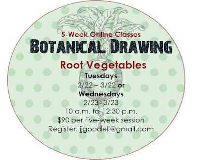
Here's a chance to study some botanical drawing, using a variety of materials: pencil, colored pencil, watercolor pencil, watercolor paint, pen and ink.

For more information or registration, please write me at this address:  jjgoodell@gmail.com.