Sunday, August 3, 2025

Doing art during tough times

These are not easy times. Headlines are screaming. People are hiding from masked characters. Prices are climbing faster than we can keep track. People, who have no criminal record, are being placed in concentration camps. And the list goes on. A lot of us feel helpless and hopeless. There's not much we can do except go on an occasional protest march or write/call our congress representatives. Simply said, it's scary.

But what if I told you that there is something you can do to recapture your joy again, and it won't require taking a magic pill. Plus, it shouldn't cost you much at all. What is it you ask? It's ART. Not only visual art, which is my specialty, but it also includes writing (creative/journal/mindful), music, dance or any number of things that bring you joy. 

Why art?
I used to think that the time I took to draw was frivolous. Something I would do as a pastime. Nothing serious. Well, that's before I made visual arts a full-time job. Now it's time well spent. Remember, I owned an advertising agency--super stressful and often not fulfilling. My goal was to make money. Business is business. Today my goal is totally different. Don't get me wrong, I like an income, especially at this stage of my life. But what brings me joy and purpose is putting pencil to paper or paint brush to canvas. 

Art brings joy.
This summer I worked on a painting project that completely knocked out the bad news and delivered happiness. It's a floor mat. I bought this floor mat at Costco because it had cushion and a non-slip feature. Unfortunately, within a month or two it started to wear. So, I got my gesso out to prep the mat, pulled out my acrylic paints, and painted what I call, "My Humble Garden." See below.

A painting of flowers and butterflies on a tile floor

AI-generated content may be incorrect.

This is no masterpiece. It was just fun with no expectations. What happened though was it became my escape place. Whenever I read or heard about something really dreadful, I would find myself out in the garage working a bit more each day. It took about month to complete--a little at a time, bestowing some grace upon me.

What do the professionals say?
So what do the experts say about doing art in challenging times? Here are a few statements I found:

  • Art helps express difficult emotions.  (Yes, I get this, maybe more in my writing than in painting.)
  • Art gives you an emotional release, even helps to process trauma.
  • One can find solace, peace and insight from participating in art.
  • Art becomes a coping mechanism, helps to manage stress and anxiety. (This is absolutely true. I cannot draw or paint and concentrate on the negative. I'm in a different zone.)
  • Art gives you a sense of control, especially if you don't have a perfectionistic goal (more on that later).
  • According to the American Congress of Rehabilitation Medicine, art increases serotonin levels, blood flow to the brain and can foster new ways of thinking. 

Perfection
One of the biggest stumbling blocks in art is perfection. I like what Michael J Fox once said, "Perfection is God's business." Exactly. What's holding you back? Not thinking you can draw or paint or play an instrument or dance? Regarding visual arts, it only takes a pencil and some paper. Scribble. Doddle. Play. Use a variety of tools--markers, crayons, color pencils. Have no goal, just let yourself go wild. In time, you'll want to do more. You can always go over to my YouTube Channel and learn how to draw a sphere from a simple circle. It's a good beginning. There are other lessons you can try as well.

But whatever you do, get going and make art. It helps, ALOT

------------------------------------------------------

A blue blot with black text

AI-generated content may be incorrect.

Fall 2025

All classes are closed for the rest of the summer. Next set of classes will begin Wednesday, September 17th and go through October 15th. The second Fall session will run from October through early December. Here's the schedule:

Back to Basic Drawing
September 17-October 15, 2025

Beginning & Intermediate Acrylics
October 29-December 3, 2025

The above classes are currently in the planning stages, but if you are interested, please let me know at jjgoodell@gmail.com. I'll make sure to contact you when everything is put together. Our Wednesday group is a great place to feel safe, encouraged and loved. 

Saturday, May 10, 2025

May/June Newsletter

 Working with Walnut Ink

We've all played with colored inks. They are so much fun. I love Indian ink because it's permanent and the acrylic inks are great because you can use layer upon layer. See my Pen and Ink article from October 22, 2015 for details on using inks in general.

But have you ever used walnut ink? For years I've work with Tom Norton's Designs, which sells walnut ink in several different bottles. And I have been greatly impressed with it. That is until I spilled almost the entire bottle--what a mess, on my clothes, floor and drawing table. Very easy to do--not a fun cleanup. I still have about 10 ml left. 

Tom Norton's Walnut Ink

So of course, I thought it was time to buy a new bottle. But instead of the Norton brand, I opted for an entirely new ink from Hickory Hill Arts. The description really captured my interest--made directly from walnuts and triple hand pressed (sounded good) and made by artists. However, I was a bit disappointed when I used the Hickory ink with my dip pen and found it to be fairly light in color as opposed to the Norton brand. So why was there such a difference between both inks.


This is when doing some research can help with a decision. Subsequently, I went up to Google and found the difference. For one, Norton's ink is not made from walnuts but is basically a watercolor ink with pigments that have the look of natural walnut ink. Hickory Ink is made completely made from the green outer husks of walnuts. The tannins in the husks create a brown color. 

However, natural walnut ink is NOT acid free. The acidity in the walnuts can cause the ink to cause some archival problems. Although, Leonardo de Vinci and Michelangelo worked with walnut ink and their works are still with us, time has seen some fading and paper damage.  

Interestingly, pure walnut ink has a tendency to etch into the paper, whereas the non-walnut inks sit on top of the paper. Natural ink is also water soluble. Norton's ink seems to lay down darker and is water soluble, although it's made with synthetic materials. Here's a blurb from the Norton brochure that explains the acidity problem.

"Rembrandt, Da Vinci and Van Gough are just a few of the artists that used walnut ink in their drawings! 
 
Unfortunately their inks were made with real walnuts, which are highly acidic, causing their incredible drawings to fade and the paper to deteriorate over the centuries. Tom Norton's Walnut Drawing Ink® is made with artist grade pigments, not walnuts, and it is both lightfast and acid free."

So how do you use this ink? First off, I use a dip pen but you can easily use your paint brush. I wouldn't recommend using it with a fountain pen, although the ink doesn't contain shellac (the Sennelier brand has shellac, which makes it permanent). Since both Hickory Hill and Tom Norton's are water soluble, you can definitely "play" with the product as soon as hits on paper. This past week in class, we worked on mushrooms.

Mushrooms using Tom Norton's walnut ink  

I drew both mushrooms with my dip pen and then took my brush and spread the ink to create shadow, as well as color in the mushroom on the left. BTW, you don't have to use more ink, just a tad of water will do the trick for spreading.

Finally, here's a link to making your own walnut ink. It takes some time, but I think it would be fun to try. 

What's new in the studio!


Any questions or concerns, please feel free to email me at jjgoodell@gmail.com

Sunday, March 30, 2025

March 2025 Newsletter

Drawing our feathered friends

This past session, we studied drawing and painting birds. Although I've taught this subject before, I found this time around, I actually learned more than I taught. Part of the reason why is I again returned to the Cornell Lab of Ornithology anatomy page. As you can see in the screen shot shown below, this interactive page helps you learn the different parts of a bird, including the skeleton.


While I don't consider myself an expert at drawing and painting birds, I did find that this site helped a great deal by giving me a deeper understanding at how everything works. Click on the above link to see how interesting the site can be.

We also covered some amazing artists this session (I always highlight an artist each week). Especially interesting is Giuseppe Arcimboldo (1527-1593), who is famous for his serial paintings. One in particular is The Four Elements: Air, Earth, Fire, and Water. (He also created a series called, The Four Seasons). In our class we were  interested in his use of birds in the Air panting. Granted, it's a little different because his whole portrait is made up of birds. Just incredible. 

Air by Giuseppe Arcimboldo

Lastly, after spending four weeks of drawing/painting birds, we ended with breaking all the rules and going with an abstraction/cartoon-like drawings the last week. It was fun. Here's an example of some fun characters.

A great project created by student Darlene Van Luvanee:


And some from me...
 Using a method called atmospheric painting.
 Just having some fun.


I really enjoyed this session and am looking forward to our next session, which begin April 9th. See below for details!  


Saturday, February 15, 2025

February 2025 Newsletter

Reflective Colors and Light

During our last on-line session, we covered light, shadow, shade and reflection. It was a good lesson, not just for the students, but for me as well. It's good to review the basics, such as: 

  • chiaroscuro (sounds like kyaro skooro), meaning the treatment of light and dark,
  • the anatomy of a shadow, 
  • shade vs. shadow; there is a different,
  • Notan (Japanese approach to light and dark),
  • and lastly reflective color and light.
We also studied five separate artists that offer great examples of light and dark, including Johannes Vermeer, Gerard van Honthorst, Francisco Goya and so on.

I was surprised at how much I forgot and how much I learned as well.  But the most fascinating part was the last class when we covered reflections. We usually attribute reflections to water (trees, buildings or boats reflecting on the river) or on shiny objects (coffee pots, glasses, etc.). But there's more to see than that.

Have you ever really looked at a reflective object that's not necessarily bound by water or a shine? For example, here's an orange on a white surface.


Underneath the orange, what color(s) do you see? That's reflective color. What about the bottom of the orange, is there a lighter color there as opposed to the rest of the orange? That's reflective light. They are both influenced by the light bouncing on the paper and/or the orange.

Let's try another. 


What do you see, reflective light, color and maybe more? How 'bout the next example. Where is the light bouncing? Instead of looking, try really seeing.


Speaking of which, in my classes, we don't just study the medium or theme for the day, we also review:
  • A weekly artist
  • "Seeing instead of looking" exercises
  • Three-minute sketches 
  • Commentary on what we are studying
  • A choice of projects.
It's more than a drawing or painting class, it's an art class that expands your knowledge and skill.

So what's up for the rest of the winter? 


If you're interested in these class, please contact me at jjgoodell@gmail.com.

See you soon.
Jill Jeffers Goodell
Glastonbury Studios

Wednesday, January 1, 2025

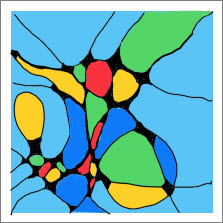
 Neurographica® art

Happy New Year!. I thought I'd start the new year off with a discussion of Neurographica® art, developed by Russian psychologist Pavel Piskarev in 2014. Last issue I quickly touched upon the subject by stating that it's a great meditative form of art, while also a boundless way to maintain mindfulness.

To give you some background, I tumbled this past summer and have post-concussion syndrome. This artform is supposed to help with your brain neurons. I can't say I'm getting cured anytime soon, but I do find that my brain seems a bit more relaxed after a neurographic workout. 

Here's a step-by-step process.

Step 1--draw lines from the edge of your paper in all directions.


Step 2--add circles if wish and then go to each intersection and curve it out.


Step 3--complete with color (watercolor, colored pencil, gouache and so on).


I love this art form. In fact, I'd say I'm a bit obsessed. I already have filled an entire folder with pieces and tried my first on my new iPad (a gift from my son). Here are some examples

One of my first tries.


Another try with a tree.


Playing with a spider web.


Even created Christmas card.


Finally...first try on my iPad.


Take a few minutes, pull out some paper and try it yourself. But be warned, it can become addictive.